

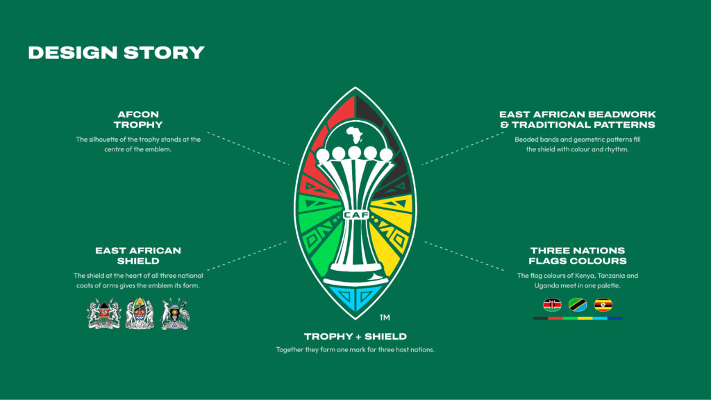
KAMPALA. Before it became the centerpiece of the AFCON PAMOJA 2027 logo, the shield already had a place on the national coats of arms of Kenya, Tanzania and Uganda.
That shared symbol gave CAF a starting point for an emblem that had to represent three countries.
The confederation and the co-hosts unveiled the logo simultaneously at 1pm East African time on Thursday, November 19, with 212 days to go before the tournament kicks off on June 19, 2027.
The shape comes from a traditional East African shield, which CAF describes as a symbol of protection, pride and belonging.
Two overlapping circles of equal size form its outline, with the silhouette of the Africa Cup of Nations trophy in the middle and a map of Africa above it.
Red and black sit at the top of the emblem, green and yellow flank the trophy, and blue fills the base.
The patterns draw on beadwork, textiles and weaving, bringing details from East African crafts into the design.
Where Uganda’s crested crane comes in
CAF developed 12 shield patterns alongside the main logo, giving each host country its own designs within the tournament’s visual identity.
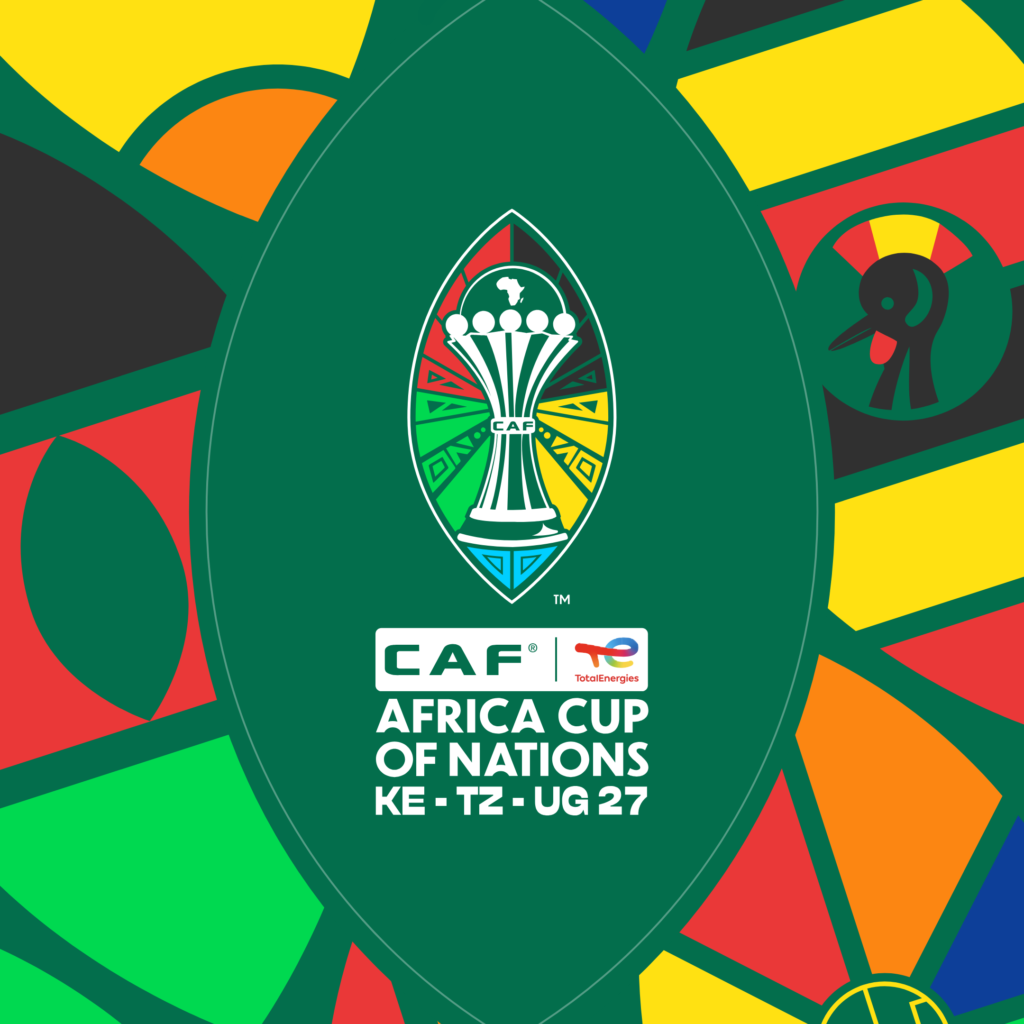
Uganda’s patterns use warm, layered colours and feature the crested crane, the national bird that gives the Uganda Cranes their nickname.
Kenya’s designs use bold horizontal bands, while Tanzania’s take their diagonal lines from the national flag. CAF says the patterns will appear in stadiums, on digital platforms and at tournament events.
Pamoja means “together” in Swahili, the shield gives that name a visual form, while the crane and the other country-specific details give fans something familiar to look for when the tournament comes to East Africa.